
PUBLICATION
I love the challenge of transforming ideas into visually engaging, easy-to-navigate layouts. The process of blending typography, imagery, and space to tell a story is incredibly fulfilling. Every project is a new opportunity to explore different aesthetics and connect with an audience, while keeping the design both impactful and purposeful. Whether it's a magazine, book, or digital publication, I thrive on creating designs that capture attention and enhance the experience of reading.
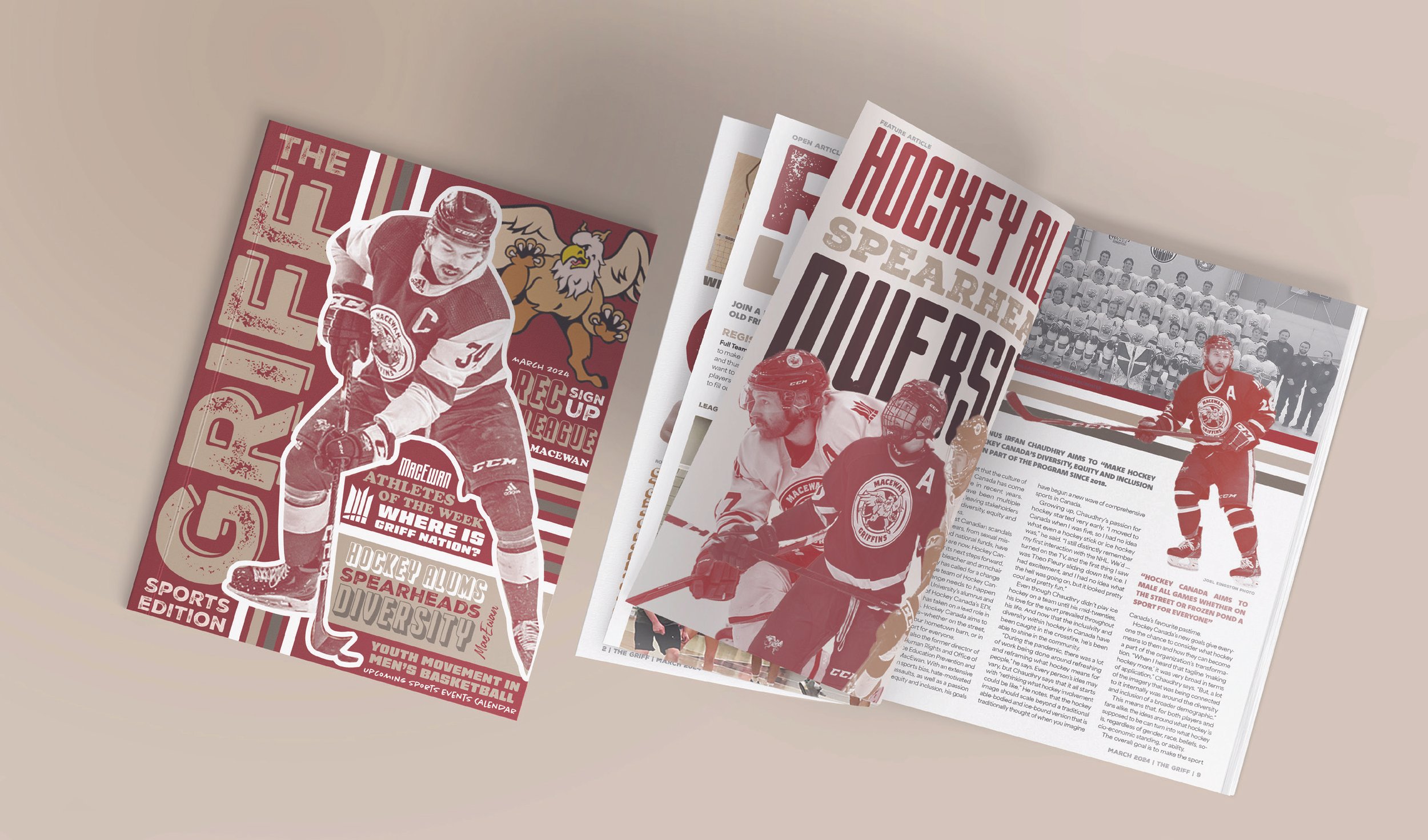
The selection and aim of this publication project version of The Griff was to focus on MacEwan Sports.The magazine's overall design inspiration was from sports graphics posters, as sports graphics are known for having large, bold type and cut-out images.The design inspiration for the cover and the feature article specifically came from old vintage retro posters.

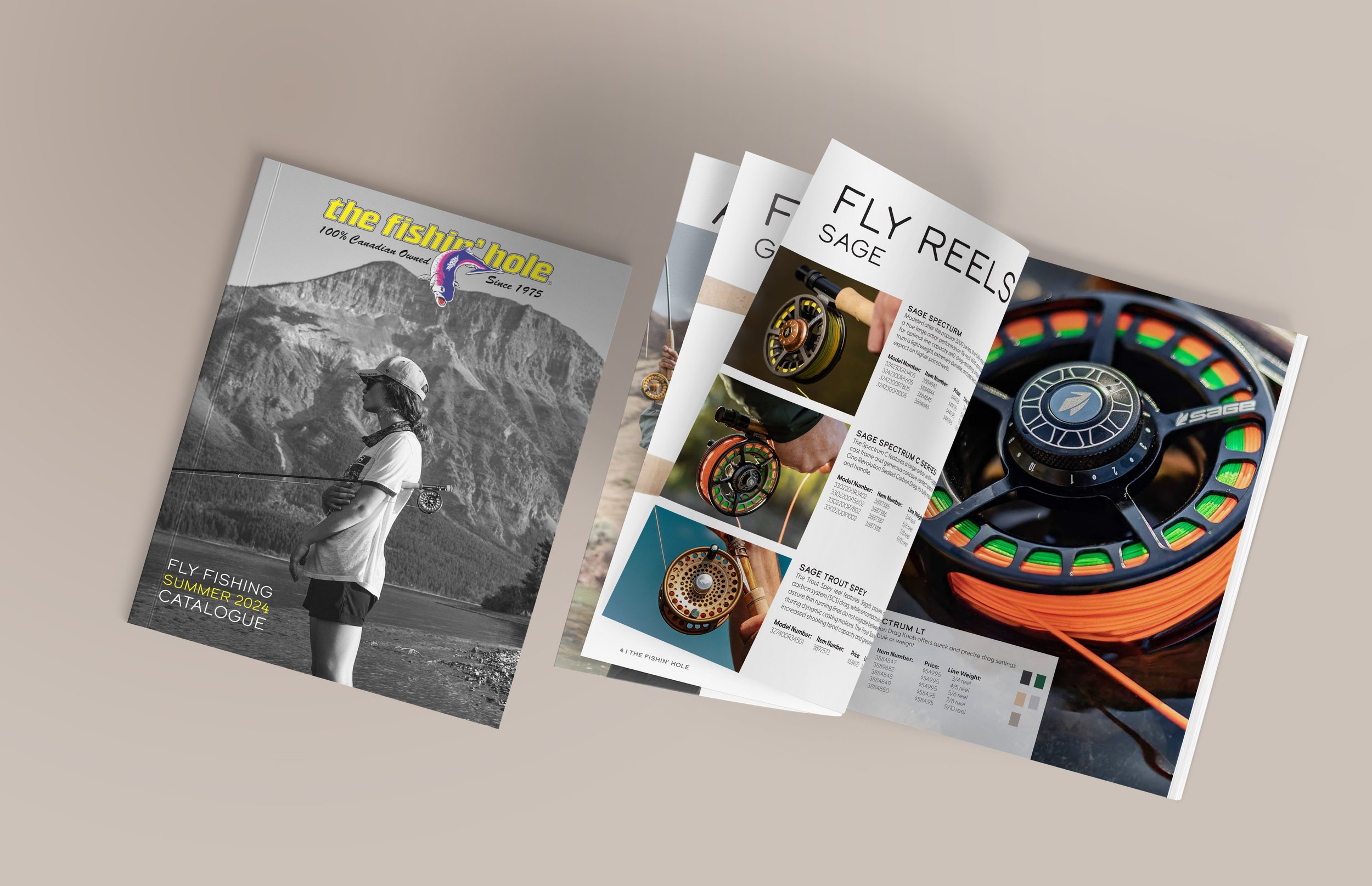
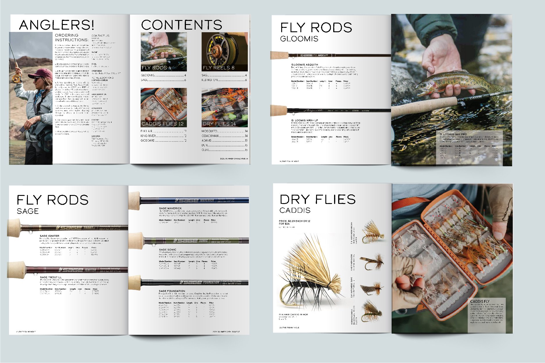
In this publication project, I redesigned The Fishin Hole catalogue, focusing on their fly fishing equipment. Photography was used to bring light and life to the catalogue making it more engaging and visual.
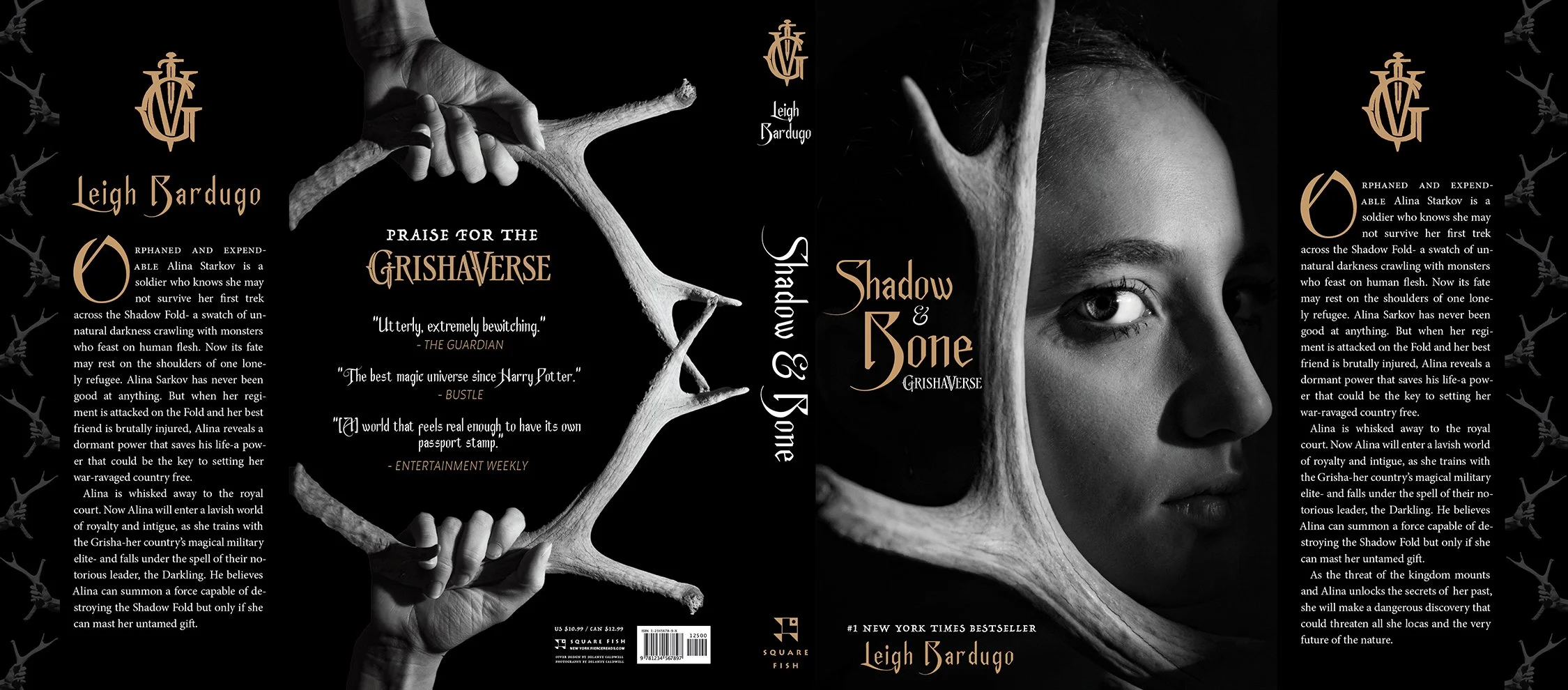
Shadow & Bone Cover (Photography & Publication). For my illustrative photography project, I chose to illustrate a book cover, and the book I chose is called Shadow and Bone. Using darkness and shadow to engulf part of my subject but still having the overall image lit helps to show the battle existing between light and dark, or in the case of the book, good and evil.

This publication was created for a editorial photoshoot.
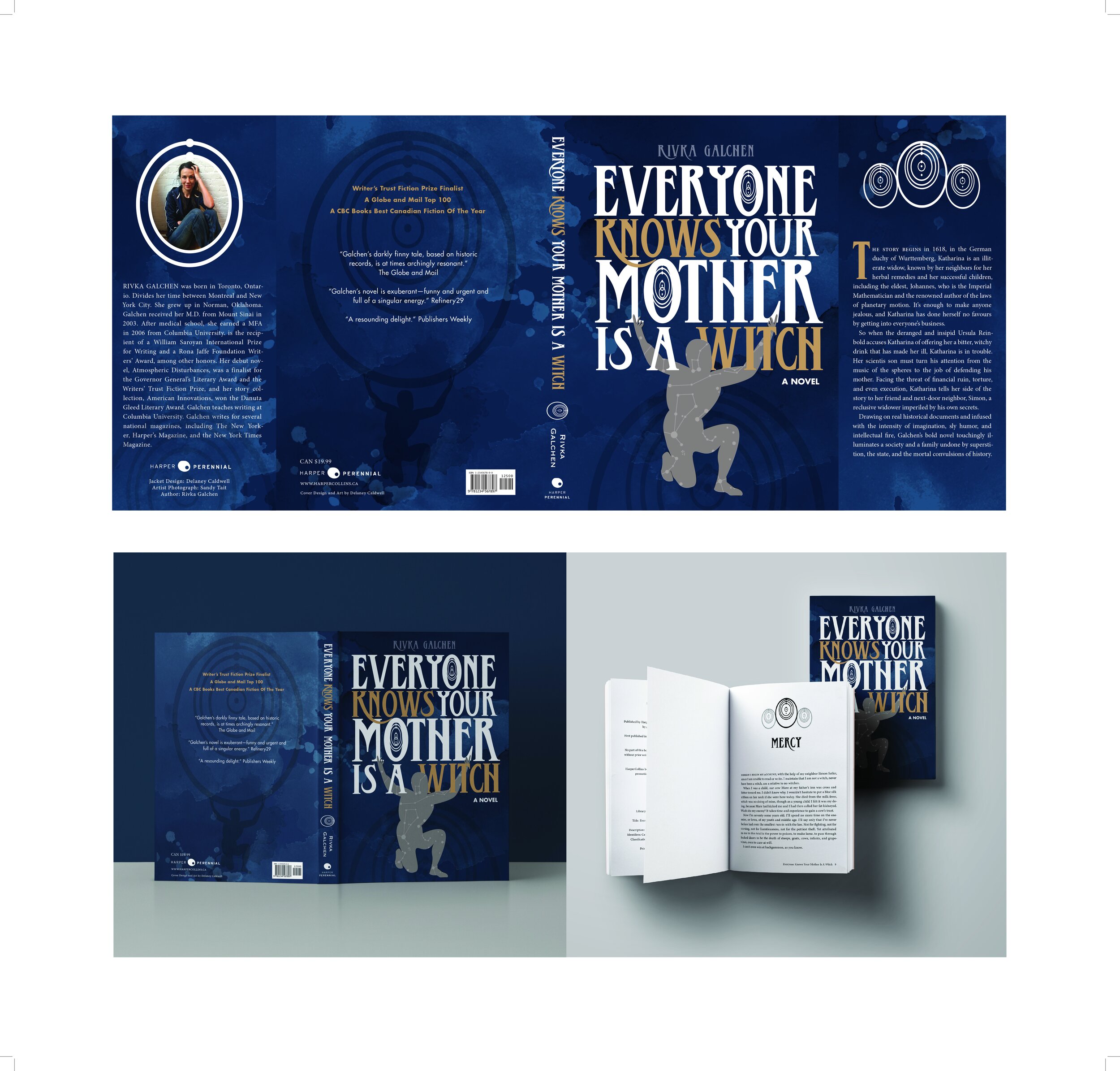
This redesign was done for a typography class where we were tasked with redesigning the MacEwan Book of the Year. The Atlas figure is symbolic of the experiences of the main character. She is trying to push back against the rumours that are bringing her down. The rumours the townspeople create about Katharina are harsh and exaggerated, putting a considerable weight on her and her family. The figure in the design does not have a face because Katharina's hardships can apply to many individuals’ circumstances. Science is also a central idea in the novel, so Kepler’s elliptical orbits from his law of planetary motion was used throughout the design.
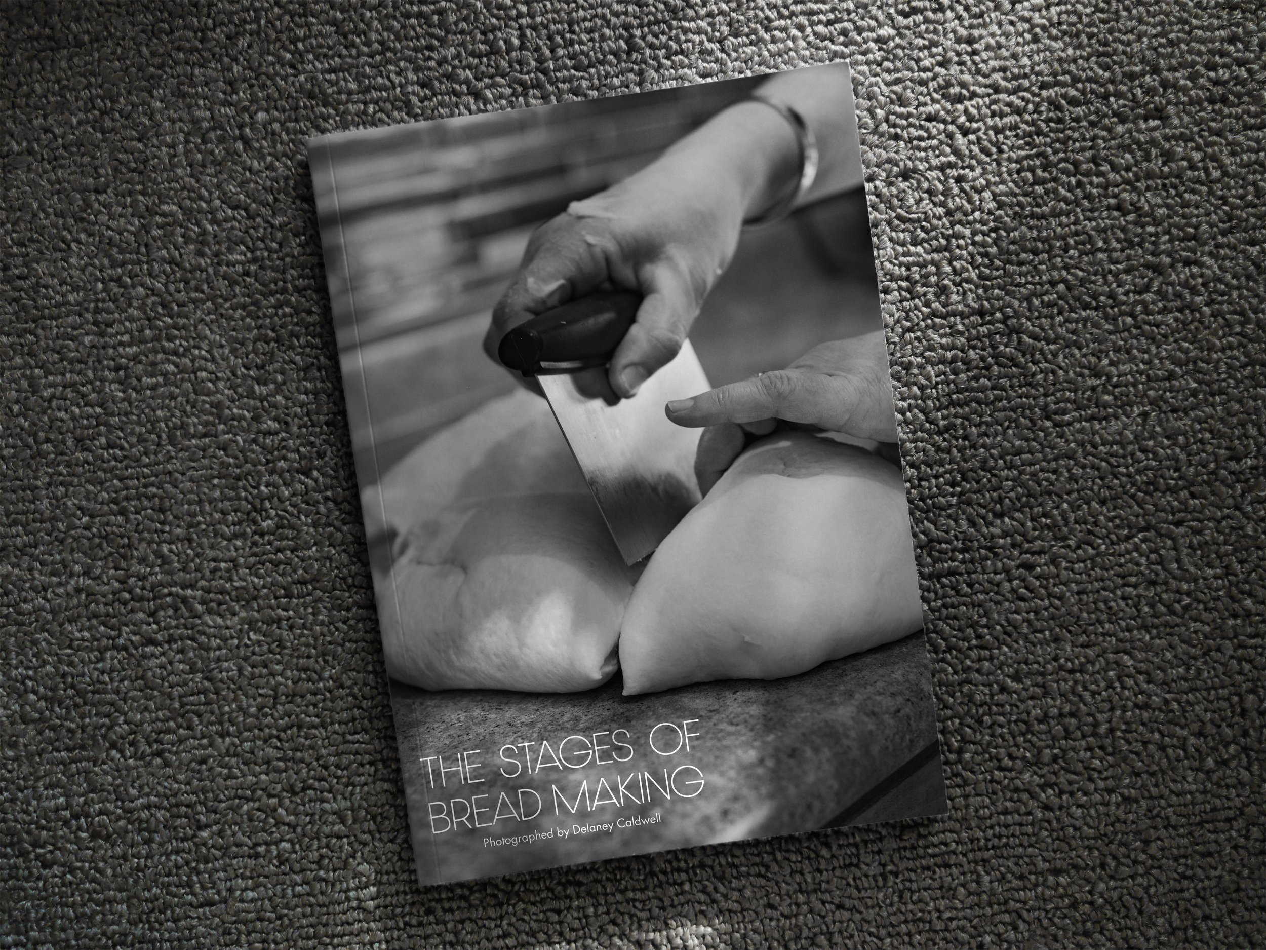
This project is a photo essay following along on the stages of breadmaking. This photo essay takes you along a journey from start to finish when it comes to baking bread. The photographs were taken in black and white to further the emotion and simplicity of breadmaking.


This project was a redesign for the Jungle Book. The leaves and the jungle's crowdedness inspired this design's visual approach. In the cover's background are the insides of a leaf, which is intended to show the depth of a jungle. A jungle is vast, but there is so much life within it, and organisms are big and small. Using the leaf motif and the inside of the leaf, I wanted to have that differentiation between looking broadly at an element vs up close. In the book, a lot is happening in how the jungle is run, which is not seen by those looking in from the outside. The leaf motif is used on both the covers and the chapter pages. It brings that natural element throughout the book and the cohesion between the cover and the inside matter.